Showing posts with label vector. Show all posts

Friday, April 10, 2015

X ROY SPEX


It's finally done! I posted my WIP pics a while ago, and now I can present my latest illustration X ROY SPEX.

I had a lot of fun working on this illustration based on the idea of Roy Orbison wearing X-ray glasses. Definitely got a lot of practice at drawing skeletons. And had the best soundtrack while working on it!

 Keep posted with my latest illustrations on Instagram.

Sunday, August 31, 2014

Illustration Mini Movie


So for a while now I've wanted to create a short video showcasing my illustrations and how I create them.  Well, I finally did it and it's a 40 second behind-the-scenes peek at my vector illustrations and the stages of creation, from initial sketches, to digital layout, colour options and the final illustration.

I had a lot of fun making it, probably the hardest thing was deciding on a song to use! But I think Queens of the Stone Age is a perfect fit.

Note: Due to the song I put with the video, Youtube won't allow the video to play on mobile devices. If you're on a mobile and want to view the video check it out on my Facebook page https://www.facebook.com/video.php?v=556098777828791&set=vb.274254949346510&type=2&theater

Wednesday, January 15, 2014

Chantuese Lily


It's finally finished! I created this poster for a super-talented singer named Lily. I designed her Dreamer EP cover a couple of years ago. This project was a lot of fun to work on, as I love creating anything relating to music. It's a bit different to my usual illustrations as I usually focus on drawing just the face, but this time I have drawn the entire body as well as background details. It's good to challenge yourself and try different things.

I did two colour variations, the client loved both and decided they wanted to use both versions in the future. 

Which version do you like better - blue or purple?


Sunday, January 12, 2014

Lily WIP


Finishing off the details before I add colour. I always work in black & white first for vector drawing so I can concentrate on the layout without being distracted by colour.

Sunday, January 5, 2014

Take the Power Back

Hmmm, where's the next place we should take over?

Happy New Year everyone! I always like to do a bit of decluttering and get rid of old sketches and paper that I have accumulated over the years. It's also nice to look back on old work that I might have forgotten like this old illustration of Rage Against the Machine.

The original thumbnail sketch is below. This illustration was done years ago, so while I can definitely see it's in my illustration style the technique is not quite refined yet.

And I still love listening to RATM!


Saturday, August 10, 2013

Adding Personality and Expression to a Character


I love posting work-in-progress pics on my blog to show the process of how I work and how an illustration takes shape. Today I would like to post a mini-tutorial about drawing the face and how small tweaks to the illustration can add personality and expression to a character.

The example I'm using is my most recent illustration Manic Cure. When starting to draw a new illustration I always begin with the eyes and the face, because it's one of the first things that the viewer will look at as the eyes are naturally drawn to look at another pair of eyes.


The first attempt at drawing the face, I wasn't quite happy with the facial expression. It looked very serene and angelic and I had envisioned the character as a sort of femme fatale, mysterious being with multiple arms.


Without starting over from the beginning, I made a few tiny adjustments to the face which changed her expression from being sweet to someone a bit more cocky and mysterious. I raised one eyebrow, narrowed the eyes and turned one side of the mouth into a smirk. Very small changes which added some spark into her character.


My Billie Joe illustration is another example of how to add expression into a character. Just by looking at the angle of the eyebrows, the shadows and wrinkles around the eyes you can inject some life into an illustration and make a more compelling image.


Draw a bunch of different mouths and see how dramatically they can change the look of an illustration. They don't need to be over-the-top to show emotion, the human face is capable of showing hundreds of emotions with the most subtle changes in expression.

So in summary, to add some personality and expression to a character think about:
  • Eyebrows: are they raised (surprised), furrowed (angry), or is one eyebrow raised (cocky)?
  • Eyes: are they big and sweet, do they sparkle or are they narrow and mysterious?
  • Lips: are they smiling secretly like the Mona Lisa, smirking or showing some teeth?
  • Wrinkles: the signs of life on a person's face and a great way to show character.

The great thing about working with vector illustrations is that you can go back and make tiny adjustments. How do you like to show personality in an illustration?

Saturday, June 15, 2013

Manic Cure


Manic Cure, my latest illo is done! It's inspired by the traditional Chinese '1000 hand dance' and the nail salon. I've always wanted to draw something with many arms, and watching the Coldplay & Rihanna videoclip for Princess of China gave me the initial idea to research the dance/multiple arms concept further. Who says watching Youtube videos is a time waster?!

It must be said that I got A LOT of practice drawing hands on this illustration, as well as crazy long nails! Click here to view my earlier blog post with the WIP process pics of this illo.

And check out my Facebook page if you haven't already (I update it more regularly than my blog these days).

Saturday, March 30, 2013

Fluevog finalist!

Will this illustration make my shoe collection $1,000 richer?

Last week I posted a sneak peek of my latest illustration. Well, I just received the most exciting news - my 'Back to School' entry into the FluevogCreative competition has been announced a finalist!

The winner is based on the public vote, and gets a $1,000 voucher to spend on Fluevog shoes!

So PLEASE click the link and vote for me - it will literally take only 30 seconds of your time (plus you don't have to sign up to any mailing lists or anything)  http://www.fluevog.com/code/fc_finalists.php 

Thank you!

Thursday, November 22, 2012

Happy Thanksgiving!


Saturday, September 15, 2012

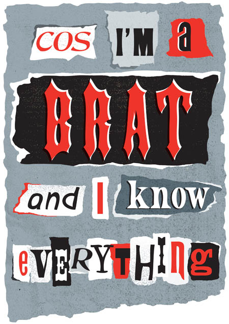
Brat Attack


Who hasn't felt like a brat at some stage in their lives? This was a project for my Jump mentorship to create a typographic poster based on song lyrics. The song is 'Prisoner of Society' by The Living End, and I was aiming for a punk DIY aesthetic with ripped up paper. I did a few brightly coloured experiments before I settled on the red, black & grey option.

View more work-in-progress pics on my Facebook Artist page.


Tuesday, July 17, 2012

Hands Up poster


New stuff! This is the latest piece of work I have completed as part of my Jump Mentorship. My brief was to make up an event with a theme that would work across a series of posters, flyers, and promotional material. I invented the fictional 'Hands Up' event as a series of uni band nights, giving an opportunity for talented young bands and musicians to play in front of live audiences and improve their skills. Each event that is held relates to a genre of music and features bands who play that genre of music.

My idea was for the series of posters to show different types of hand in all kinds of poses. They serve to connect the visuals with the event name 'Hands Up' as well as being a recognizable element that can be carried across a variety of mediums.

The last time I drew a hand on its own was the Zombie Turkey Hand I did last year (check it out here) and I had heaps of fun drawing this one. Maybe I have a fascination with drawing green hands??

Monday, July 9, 2012

Andreas Krapf


'Sweeet!' Were my thoughts when I saw the work of Andreas Krapf. I love the cuteness and storylines in his illustrations, the Ray Ban's ad is my fave. Check out more of his work here.

Sunday, June 10, 2012

Lower Dens poster


Here is the second project I have completed as part of my Jump mentorship. My brief was to design a poster for the band Lower Dens with a focus on abstract imagery. I usually like to draw people, so this was a great project for me to focus on typography and textures. Creating the 3D typography was much easier than I thought it would be - all I can say is that the 3D tool in Illustrator is the boss!

My original sketch and rough composition

Thursday, June 7, 2012

Poster sneak peek


Here is a peek at the latest project that I am working on as part of my Jump Mentorship.

Friday, June 1, 2012

Lana Del Rey poster


I can finally reveal the rest of my illustration, after the sneaky peek of the eyes I posted earlier this week. I love Lana Del Rey's music, when I first heard her album Born to Die I was blown away and listened to it repeatedly.

This is my entry into a competition to design a concert poster for Lana's three night performance dates at the El Rey Theatre. Lana has a sort of vintage Hollywood glamour, so I wanted to evoke a 1950s silver screen siren feel to it. A lot of things (good and bad) have been written about her on the web, Twitter, etc, but in the 1950s newspapers were the main medium for tabloid scoops of famous figures. This led me to create the background with a newspaper feel of headlines taken from her lyrics.

I always like to push myself and try new things, and with this poster I had a go at adding some texture and grit to it.

Gritty texture to achieve a newspaper feel
And as with all projects, I started off with research and creating a mood board of pics.


Monday, May 28, 2012

The eyes have it


A screenshot of the current illustration I'm working on. I always start with the eyes as they are the most important feature of a person's face.

Although it's tempting to just draw one eye and then flip it round to create the second eye, I don't because the human face is never perfectly symmetrical and small differences in the eyebrows can show different emotions. When the eyes look good, I feel happy that the rest of the illustration will turn out alright  :)

Saturday, April 28, 2012

Warpaint poster


Something new! A while ago, I posted about being selected to participate in the Australia-wide Jump Mentorship Program. I have always aimed in my career to head towards doing designs for music-related projects, and part of my mentorship with WBYK involves them setting projects for me that relate to music.

My first project was to design an Australian tour poster for Los Angeles indie band Warpaint. Their music takes a few listens to get to know, and the overall feeling is very dark, dreamy and hypnotizing (I recommend checking out their music! My favourite song is Undertow). To get that sprawling, atmospheric feeling in my illustration I tried something a bit different from my usual style and used blobby shapes of colour instead of outlining everything in black.

To do the Warpaint text, I painted it then scanned it in. It actually took longer than I thought to get the perfect letters!


Tuesday, April 10, 2012

Aseo


I love the incredible vector artworks by Philippine artist Vincent Rhafael Aseo. Aren't the vibrant colours and swirling linework just so amazing? Check out his website here.

Thursday, December 15, 2011

Vectips Interview


Vectips recently interviewed me for their website. I definitely recommend illustrators checking out their site, it is updated regularly with inspiring content about all things vector. You can read the interview here. Thanks Ryan!
Related Posts Plugin for WordPress, Blogger...