Showing posts with label poster. Show all posts
Wednesday, January 15, 2014
Chantuese Lily
It's finally finished! I created this poster for a super-talented singer named Lily. I designed her Dreamer EP cover a couple of years ago. This project was a lot of fun to work on, as I love creating anything relating to music. It's a bit different to my usual illustrations as I usually focus on drawing just the face, but this time I have drawn the entire body as well as background details. It's good to challenge yourself and try different things.
I did two colour variations, the client loved both and decided they wanted to use both versions in the future.
Which version do you like better - blue or purple?
Labels:
gig poster,
girl,
illustration,
Lily,
poster,
typography,
vector
Saturday, September 15, 2012
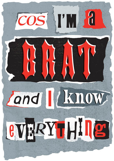
Brat Attack
Who hasn't felt like a brat at some stage in their lives? This was a project for my Jump mentorship to create a typographic poster based on song lyrics. The song is 'Prisoner of Society' by The Living End, and I was aiming for a punk DIY aesthetic with ripped up paper. I did a few brightly coloured experiments before I settled on the red, black & grey option.
View more work-in-progress pics on my Facebook Artist page.
Labels:
brat,
illustration,
Jump mentoring,
poster,
Prisoner of Society,
punk,
ransom note,
red,
ripped paper,
The Living End,
typography,
vector
Saturday, April 28, 2012
Warpaint poster
Something new! A while ago, I posted about being selected to participate in the Australia-wide Jump Mentorship Program. I have always aimed in my career to head towards doing designs for music-related projects, and part of my mentorship with WBYK involves them setting projects for me that relate to music.
My first project was to design an Australian tour poster for Los Angeles indie band Warpaint. Their music takes a few listens to get to know, and the overall feeling is very dark, dreamy and hypnotizing (I recommend checking out their music! My favourite song is Undertow). To get that sprawling, atmospheric feeling in my illustration I tried something a bit different from my usual style and used blobby shapes of colour instead of outlining everything in black.
To do the Warpaint text, I painted it then scanned it in. It actually took longer than I thought to get the perfect letters!
Saturday, July 2, 2011
Local celebrity
I made it to the pages of the local newspaper! They wrote an article about a poster design I entered for a local youth arts and music festival, which ended up being chosen as the winning entry.
I look quite happy in the photo because the photographer was making me laugh by saying "Give us another one of those smiles!"
Friday, June 10, 2011
American Artifact
I love gig posters. Hands down, they are one of my favourite things in the world. Recently I was casually browsing the internets when I discovered there was a documentary about gig posters called American Artifact that featured some of the most awesome artists in the world. I was like, "NO WAY!"
So I bought it (even though I was a tiny bit hesitant at the price of nearly $40 for a DVD). And I can say that it is the most inspiring thing that I've watched for a long, long time. It just reminds me of why I got so excited about gig posters in the first place. There's a real DIY feel throughout the film, as many of the posters artists quit their jobs and started doing what they loved, even though they were struggling financially.
I love how Frank Kozic says that his original goal when making posters was to get people to say "How can this exist? Who the f*ck made this?"
One of the poster artists featured is Emek, who just churns out amazing poster after amazing poster. The video below was from the bonus disc showing deleted scenes and it gives some insight into his process - he uses fineliners to draw insane amounts of detail. He definitely is the thinking man's poster artist.
If you are into gig posters, this is a seriously awesome doco.
Labels:
American Artifact,
documentary,
Emek,
Frank Kozic,
gig poster,
inspiration,
music,
poster
Thursday, March 31, 2011
Thunder!
Today is Angus Young's birthday. Yep, the devilish schoolkid turns 56 (!)
I was so totally nutso about AC/DC when I was in high school. I listened to them constantly, even listening to grainy bootlegs of live recordings. Hanging out with people, I would tell them obscure facts about the band, regaling how they had to cross the Nullarbor to travel to gigs (though I was often met with glassy-eyed stares). Classes at school were an opportunity to practice drawing the AC/DC logo in the margins of my school paper. And whenever there was a project at school where you had some freedom in choosing the topic, well, I didn't even have to think about what to base the project on.
It was about this time that I discovered the Art of Modern Rock book, profiling the work of gig poster artists. I was hooked. One day in Art class, we were given the project of designing a movie poster, and naturally I chose the feature film Let There Be Rock. When deciding on how to create the poster, I chose the somewhat ambitious task of doing an A2 size eleven colour process screen print.
Looking back on these posters, it kinda makes me want to try my hand at silk screening again. Although the final result was pretty basic and unrefined with quite a few mistakes, I really like the raw and textural feel of the screen print. No two posters are alike, and it feels a bit more special that I screened all the colour separations myself, rather than just clicking the print button.
And just a note for those of you who live in WA, the Western Australian Museum will be holding an exhibition called AC/DC: Australia’s Family Jewels running from 16 April to 7 August 2011. Can't wait!
Subscribe to:
Posts (Atom)